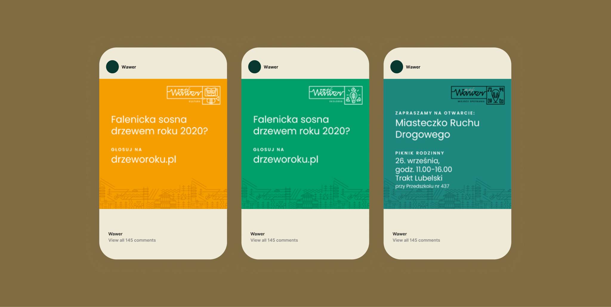
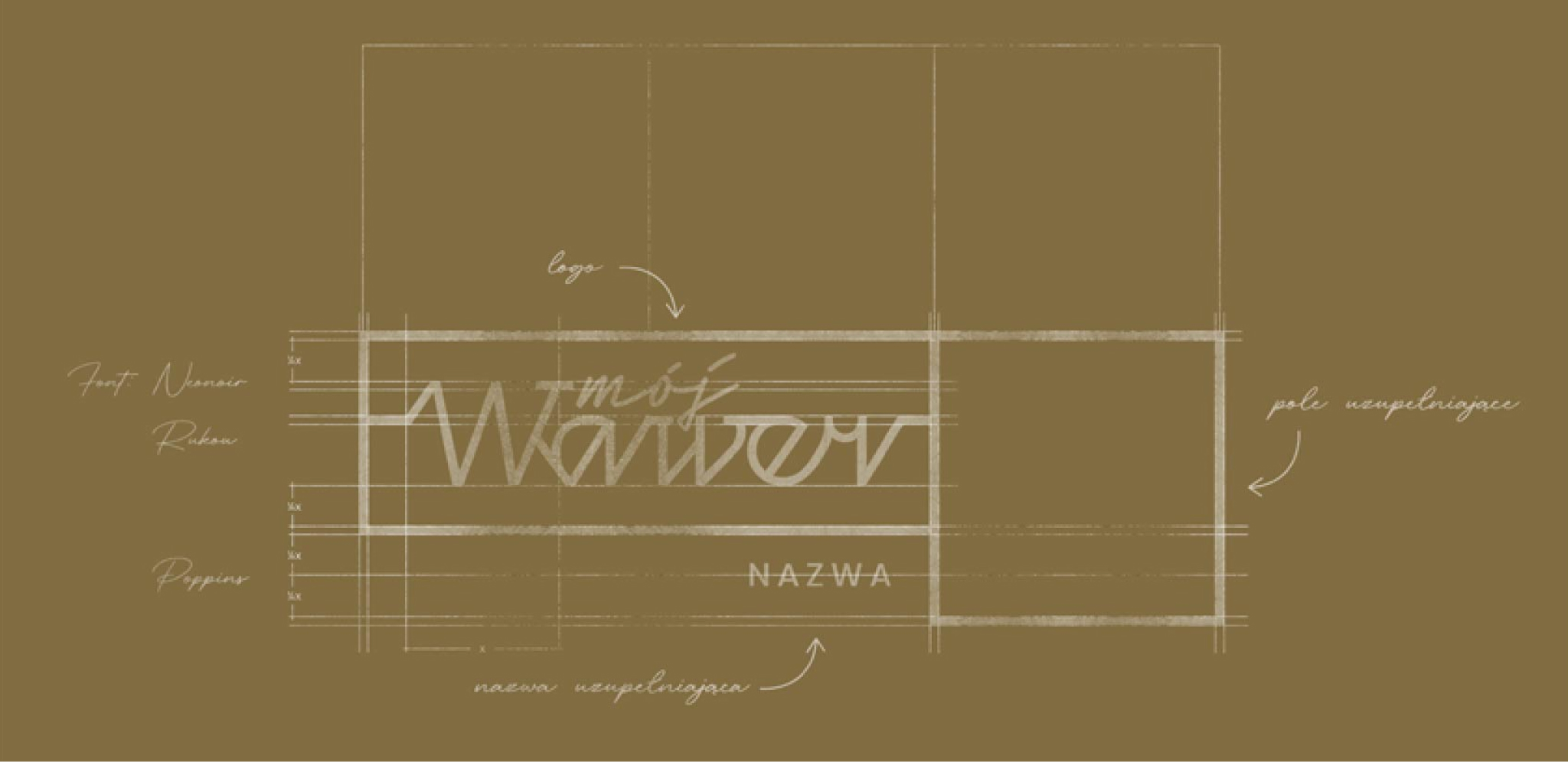
Did you know that Wawer is the greenest and largest district of Warsaw? Creating the comprehensive visual identity of Wawer, we paid special attention to its unique microclimate. We first surveyed the district like architects who plan to build something completely new but also something perfectly synchronised with the spirit of the location.

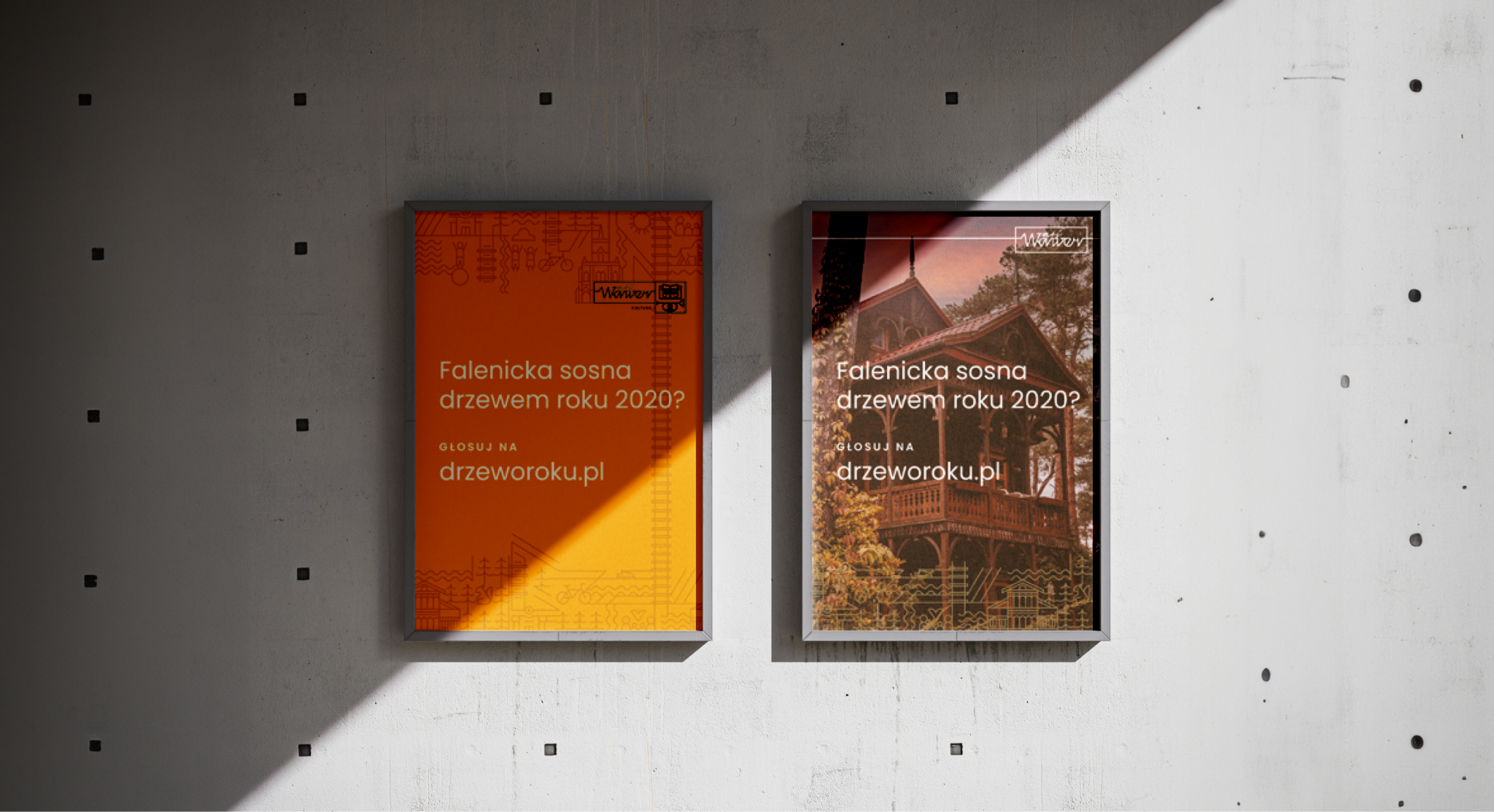
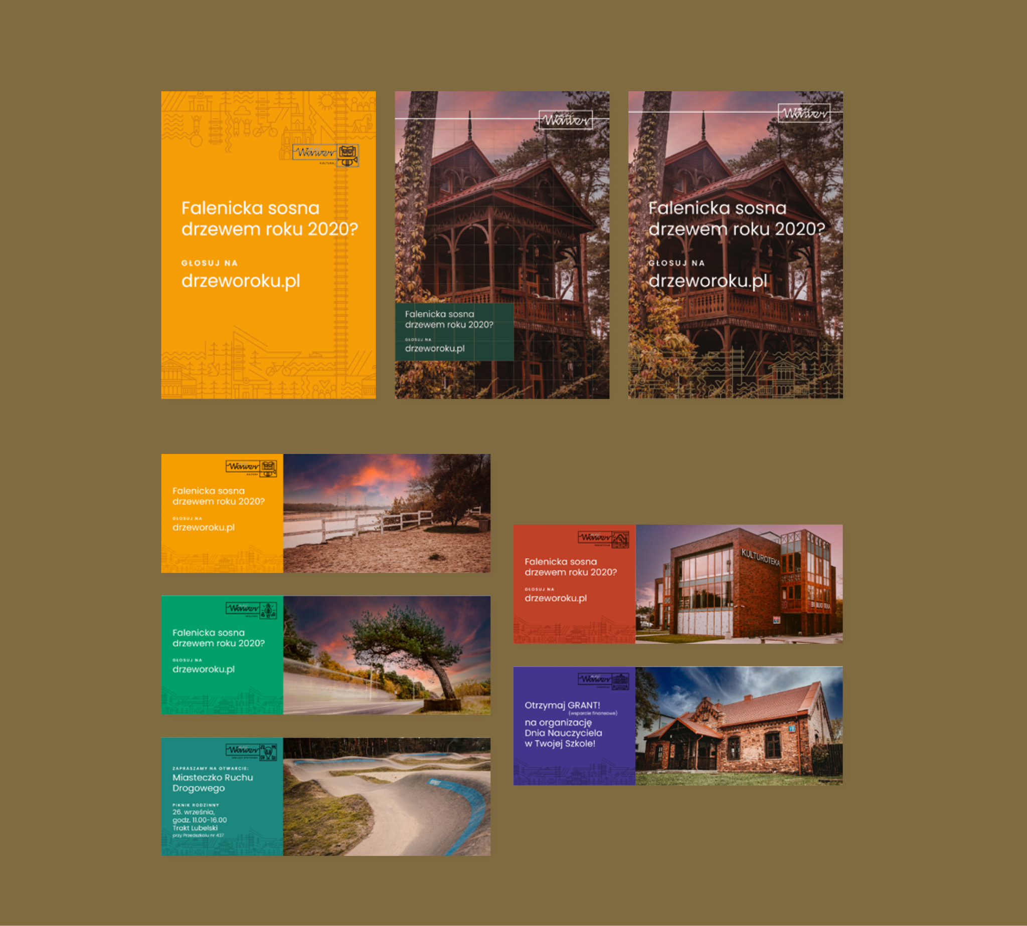
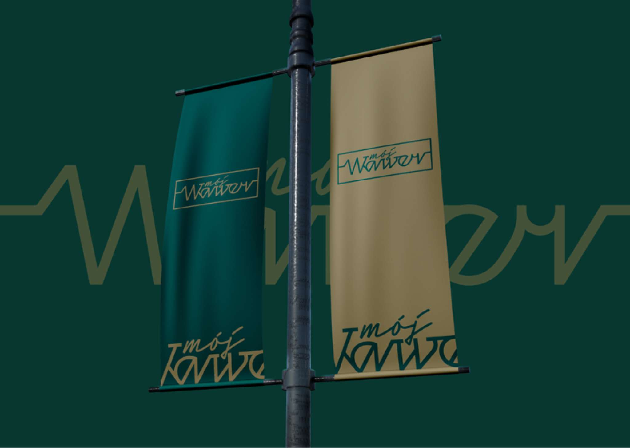
Our task was to create a project that was clear and friendly to Wawer residents; one that would distinguish the district and highlight its advantages. We wanted branding elements to be not only on the website but also on the streets of the district.
Part of the project included, among other elements, a mural that was placed on the wall of the Municipal Office. It depicts a map of the district and reminds residents that it is worth taking a walk among trees after work.

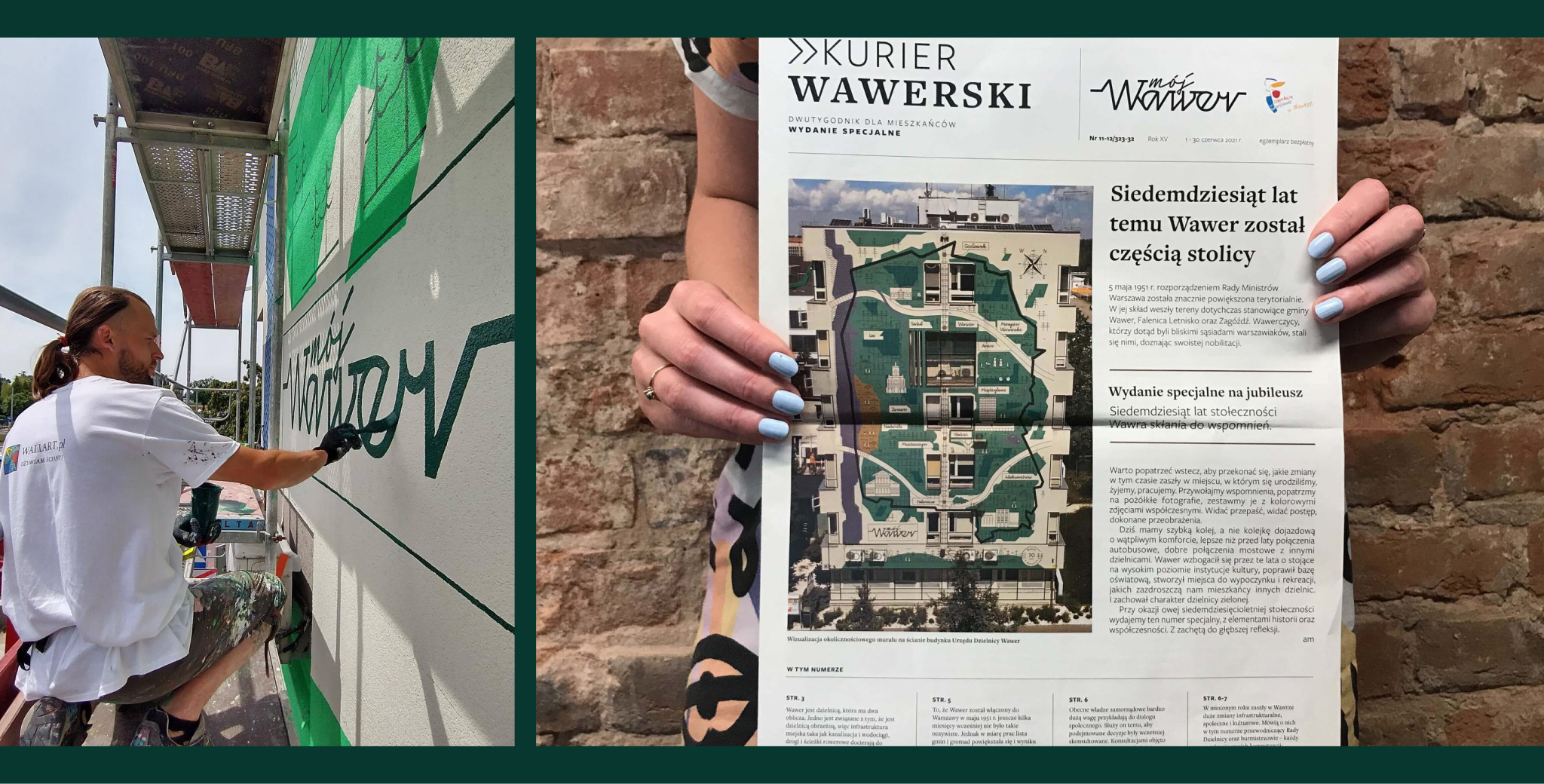

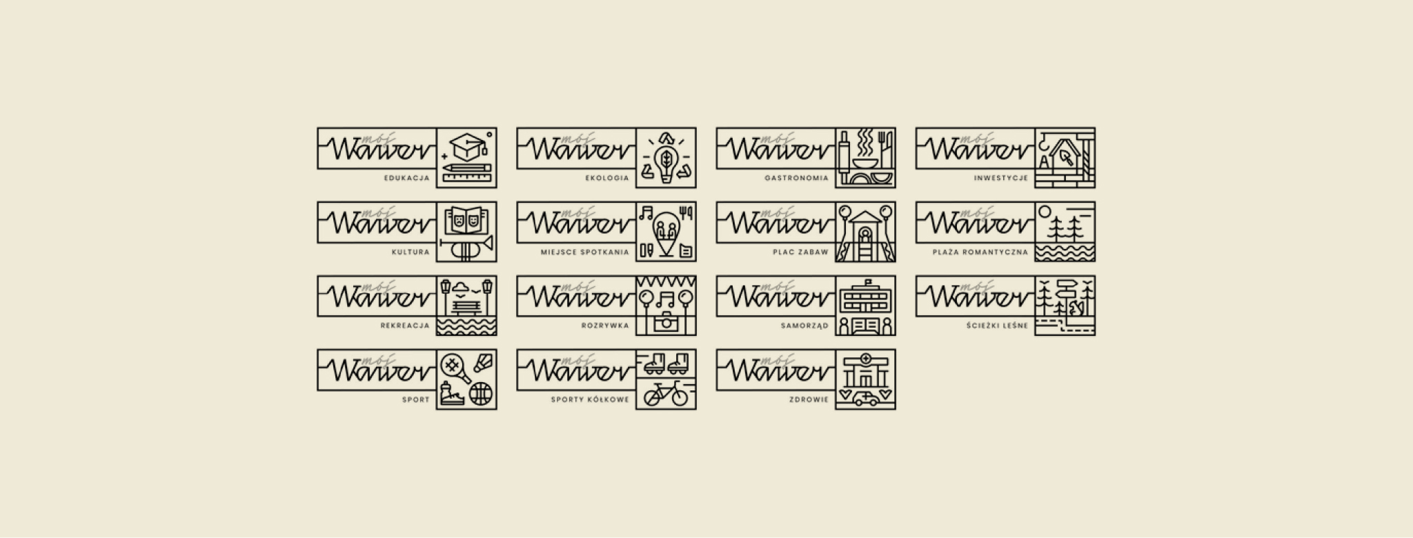
We created an entire iconographic system that drew attention to Wawer’s uniqueness and attractions. For busy district residents, who often treat Wawer as a ‘dormitory,’ it became a call to action to get to know the area and discover its rich nature. For visitors – a designer map that would showcase the district and ensure a positive reception by Wawer residents.
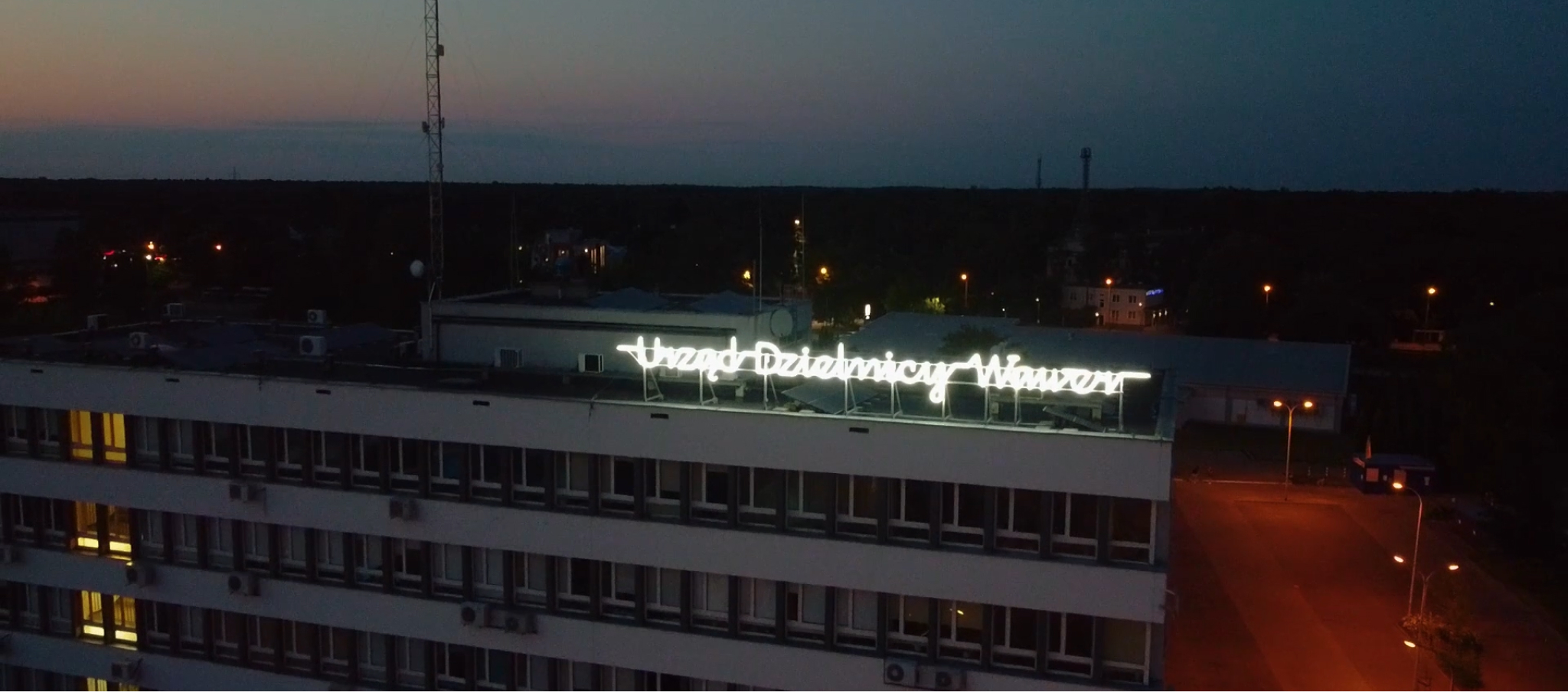
An integral part of the branding was also the neon sign placed on the municipal government building. We had great fun designing for an advertising format with a long tradition dating back to the 20s of the 20th century. The mural aimed to symbolically improve communication with residents, indicating the openness and commitment of the district authorities. “We are here and we are here for you” – this is what it says.
